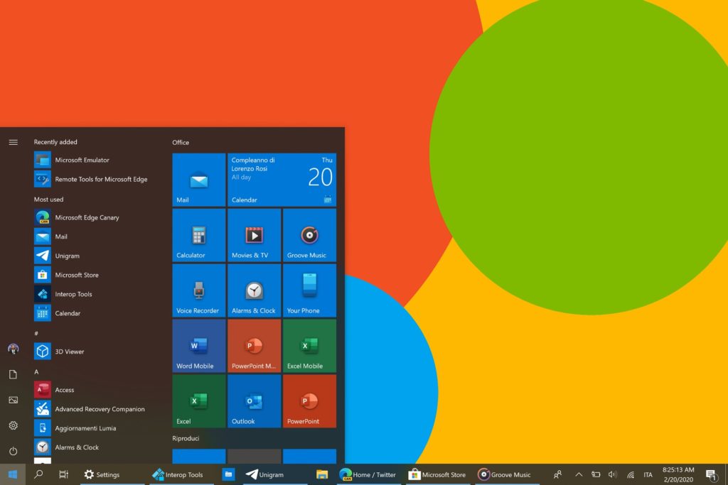
Microsoft has started rolling out new Fluent-based icons for Windows 10 apps and system applications to Insiders on the Fast Ring.
Starting today with the Windows 10 Mail and Calendar icons, Microsoft is slowly releasing new updated and colorful icons to users running Windows 10 Insider builds

These icons will be phased in over the next couple of months through app updates via the Microsoft Store and via release previews of Windows 10.
Windows 10 Insiders in the Fast Ring will start to see the new icons sooner as they are pushed out in new versions of apps being tested by Insiders.
As reported by Aggiornamentilumia.it, for some people these icons have already started rolling out to Insider builds.

In tests with three Windows 10 Insider builds running today’s released Fast Ring build, we still see the old icons but we do expect to see them over the next couple of days.
As with all Microsoft rollouts, not everyone will see these new icons at the same time but should begin to see them over the next couple of days.
A more fluent set of icons
Using the Fluent Design System, Microsoft has modernized their icons to contain more depth and color so that they are recognizable among both mobile and desktop operating systems.
“The addition of color also gives a cohesive design language across platforms: the icon that’s familiar in Windows 10 is the same on Android, iOS, and Mac, providing a wayfinding path across your digital life,” Christina Koehn, Principal Design Director at Microsoft, explained in a blog post. “The new rounded corners across the Windows 10 interface achieve the same goal: making these icons feel like they live in the real world; something familiar and approachable to grab onto.”
As you can see from the icon gallery below, Microsoft has created new icons for almost every Windows system application and app. This includes File Explorer, Office, Windows Defender, Calendar, Calculator, Mail, Snipping Tool, and the Microsoft Store.


